PRPS Launches New Brand to Match Innovative Learning Approach
A committee was formed in Spring of 2022 to explore a new brand for Prairie Rose Public Schools. A variety of staff were involved with the committee, including administrators, teachers, support staff, members of the executive team, and a trustee. The goal was to create a new and timeless logo that represented the vision of PRPS.
Prairie Rose Public Schools was created in the mid-1990's following the amalgamation of four separate school districts. The first brand consisted of some books and an apple, which was changed to the rose brand in the early 2000’s. During the last academic year, each of the schools either rebranded or updated their brands, with Eagle Butte being the final school to complete the process. As PRPS is a continually evolving school division and both the font and brand were outdated, it was decided to create a new one for the division in Spring 2022.
Board Vice-Chair Patty Rooks stepped up to be the voice of the trustees as the Board of Trustees felt they also needed a fresh look to integrate with what the division was doing.
“The brand committee was great; everybody is so passionate about their school and where they are geographically. It was important to everyone that we as a school division represent our geographic diversity yet uniqueness and bring that together,” said Rooks. “I enjoyed working and hearing so many different opinions with others bringing things to the table I’d never thought of. That passion people brought, it was exciting to see, and everyone had their unique perspective. Bringing it together as one to be cohesive I felt was a wonderful experience.”
PRPS worked with Flag Five and the committee completed a brand strategy questionnaire, which the designer used to create several brand options. THe committee wanted a brand that was youthful, innovative, creative, forward thinking and collaborative. Additionally, highlighting the inclusivity and diversity of the student experience within the division.
“The committee felt strongly that PRPS is large geographically with the landscape up north being very different than down south. It was important to see parts of all the district in the brand,” stated Director of Communications Angela Baron. "We wanted to make sure we stood out based on what we are doing for kids and being innovative in programming. We felt it was important to have the idea of forward momentum, forward thinking, innovation, always moving ahead and not being stalled along with remaining youthful in those programming decisions.”
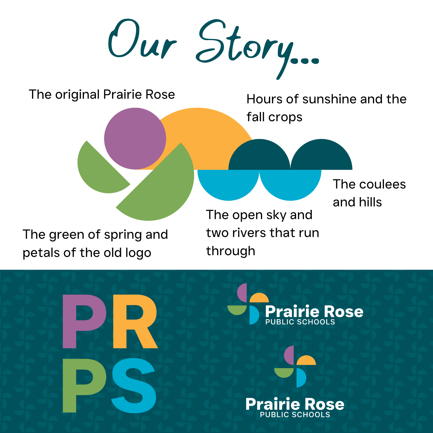
| The new PRPS logo is broken into half circles and placed into a scenic landscape to showcase how the colours and design was chosen for the new brand. |  |
The new brand is neither traditional nor dated with the new design representing a pinwheel to create a sense of forward momentum and moving ahead. The committee was cognizant of not having too many colours in the new logo and there were numerous discussions on what colours to use.
Maintaining nostalgia for the old brand was also important and this is carried forward into the new one. Looking at the colours, pink represents the rose of the old brand. If the pink colour is made into a full circle and the green is moved over, it incorporates the old rose logo into the new brand. While the green is also part of the rose, it also represents the green petals of the old flower and new life that sprouts in the spring. Yellow represents crops and the abundance of sunshine and the fall crops. Blue is for the sky and the two rivers - South Saskatchewan River and Red Deer River - that flow through the school district.
“Education is no longer just done sitting in a classroom,” commented Baron, “it’s done going out and having those hands-on learning experiences, which we do a lot of in Prairie Rose and our rural environment makes that possible.”
Rolling out a new brand is a process that will take time. Internally, the process is already complete and the new logo can be seen each time a staff member or student turns on a division computer. The logo is now available for all staff to use and anything new coming out has the new brand and colouring on it, including promotional items.
“For me, the most important thing is for people to see where they fit in the brand and why it is what it is,” concluded Baron who added the rollout for the new brand should be completed by the beginning of the 2024-25 school year.
By Samantha Johnson, Prairie Rose Public Schools Content Writer


